
How I increase customer engagement by 120%
How I increase customer engagement by 120%
How I increase customer engagement by 120%
Total screens
250+
downloads
1 laks +
Focused on
MSMS’s Transactions


Role
UX designer and project lead for BIZ application
UX designer and project lead for BIZ application
UX designer and project lead for BIZ application
Team
3 member and Project manager
3 member and Project manager
3 member and Project manager
Timeline
12 months
12 months
12 months
The Challenge
The Challenge
I started my task to design an end-to-end business application for the YES Bank merchant ecosystem that would redefine simplicity and efficiency for their merchant partners.
My core challenge was clear: how could I empower merchants to seamlessly collect money via both UPI and the emerging CBDC, while simultaneously giving them unprecedented control over their complete financial transactional data? This wasn't just about payments; it also encompassed automating settlements and providing the flexibility to create multiple terminals for a single QR code.
To tackle this, my immediate priority was to dive deep into the world of the financial user—the merchant. This meant going beyond surface-level understanding to truly grasp their daily operational intricacies, their frustrations with current systems, and where their time was being wasted. My aim was to uncover precisely how a thoughtfully designed digital experience could strip away complexity, making their day-to-day financial lives demonstrably simpler and easier.
Why Now?
Why Now?
By January 2022, India was primed for a FinTech revolution. UPI was already a dominant force, rapidly digitizing consumer payments, yet merchants still lacked comprehensive digital management tools. Crucially, the RBI was signaling the imminent arrival of CBDC, highlighting a future twin-pillar payment ecosystem. This convergence presented Yes Bank with an unmissable strategic window: to launch an application that not only leveraged the ubiquitous UPI but also proactively integrated CBDC, simplifying financial operations for merchants and cementing Yes Bank's position at the forefront of India's accelerating digital economy.
By January 2022, India was primed for a FinTech revolution. UPI was already a dominant force, rapidly digitizing consumer payments, yet merchants still lacked comprehensive digital management tools. Crucially, the RBI was signaling the imminent arrival of CBDC, highlighting a future twin-pillar payment ecosystem. This convergence presented Yes Bank with an unmissable strategic window: to launch an application that not only leveraged the ubiquitous UPI but also proactively integrated CBDC, simplifying financial operations for merchants and cementing Yes Bank's position at the forefront of India's accelerating digital economy.
The Process
The Process
My initial sprint kicked off with a deep dive into a critical core application feature: "Manage Terminal." Understanding this flow wasn't just about functionality; it was about laying the groundwork for how merchants would truly control their operations. I immediately engaged with Product Managers to grasp the strategic vision, then immersed myself in the market. I conducted a thorough competitive analysis, studying giants like Paytm and PhonePe to understand not only their existing solutions but, crucially, why and how their business users were leveraging similar features. This wasn't just about replicating; it was about identifying unmet needs and understanding the fundamental requirement for this capability within Yes Bank's unique merchant ecosystem.
Through a series of intense discussions and multiple UX brainstorming workshops, we distilled these insights into concrete use cases and scenarios. This collaborative process ensured we were solving real-world problems with a shared vision, culminating in the refined user story and scenario that would guide our design efforts.

The Core Requirement: Role-Based Terminal Access
Here's the finalized user story that emerged, clearly defining the merchant's need:
User Story: As a seller, I want to control the access of VPA/QRs to particular sub-users so that I can declutter transaction information for my sub-users. This will be achieved by role-based access to VPA/QRs, allowing me to assign one terminal or QR to a single sub-user or multiple sub-users.
Scenario: Imagine a seller with a shop operating multiple counters. They register on the app and their primary goal is to track collections counter-wise. Beyond that, they need to receive notifications for each transaction happening at every counter. Critically, they require the ability to provide specific access or assign a particular counter QR to specific sub-users or even multiple sub-users.
That's a crucial insight – the need for maximum upfront efficiency to save precious time for busy merchants. This understanding became my guiding principle for the "New Terminal" flow, from creation to sub-user assignment.
My core focus was to design an experience for small merchants who, as research showed, often lack the financial literacy to navigate complex applications. My goal was to create an interface where every essential action could be performed in just a few clicks, saving them critical time during a busy day.
I was guided by a key finding: a merchant spends approximately 80% of their time on the home screen. This meant that all vital options had to be immediately accessible there. I applied this same principle to every major feature, ensuring that when a merchant visited the "Terminals" page, they could perform all necessary actions directly on each terminal's card, without ever having to drill down into a separate screen. This "upfront" design philosophy stripped away complexity, allowing merchants to manage their finances with speed and confidence.


The Results
The Results
To ensure my designs were not just aligned with user goals but were truly intuitive and feasible for daily use, I led a rigorous two-phase validation process. First, I conducted Closed User Group (CUG) testing, followed by User Acceptance Testing (UAT).
To ensure my designs were not just aligned with user goals but were truly intuitive and feasible for daily use, I led a rigorous two-phase validation process. First, I conducted Closed User Group (CUG) testing, followed by User Acceptance Testing (UAT).
Closed User Group (CUG)
For the CUG phase, I personally collaborated with the bank to interview and test with over five merchant groups, each with 7 to 12 participants. I observed them performing core tasks like "Complete Settlement" or "Add new sub-user." These sessions provided invaluable, first-hand observations that I immediately translated into critical design improvements for the final release.
The impact of these user-driven changes was significant: the refined designs resulted in a 30% to 45% boost in engagement and task completion during subsequent testing, directly validating the effectiveness of my human-centric approach.

After implementing all the observations from CUG testing before going live I have complete UAT testing as well to make sure the released version should be as perfect as I can give. After getting all observation from UAT I have conducted multiple session and workshops with developer team to explain each and every component to them how it should visually look and working with Figma designs.
After implementing all the observations from CUG testing before going live I have complete UAT testing as well to make sure the released version should be as perfect as I can give. After getting all observation from UAT I have conducted multiple session and workshops with developer team to explain each and every component to them how it should visually look and working with Figma designs.

User Acceptance Testing (UAT)
User Acceptance Testing (UAT)
With all CUG observations successfully implemented, my final step before going live was to conduct rigorous User Acceptance Testing (UAT). This process was critical for a final, comprehensive check, ensuring the released version was as perfect as possible. During UAT, I collaborated with key stakeholders to meticulously test every flow against business requirements, validating that the end-to-end experience was seamless and bug-free.
With all CUG observations successfully implemented, my final step before going live was to conduct rigorous User Acceptance Testing (UAT). This process was critical for a final, comprehensive check, ensuring the released version was as perfect as possible. During UAT, I collaborated with key stakeholders to meticulously test every flow against business requirements, validating that the end-to-end experience was seamless and bug-free.

Learning and Future Steps
Learning and Future Steps
This project was my entry into the FinTech world, and it was a steep, rewarding learning curve. I didn't just learn design; I quickly became fluent in new financial flows like CBDC and POS collections. Beyond the product itself, the project was a masterclass in stakeholder management. I learned to align diverse leaders and teams, keeping everyone on the same page whether we were in client offices or on video calls.
On the leadership side, I was able to motivate my design team to deliver our best work, and I'm proud to say we left a lasting mark. A major achievement was the complete Design System I created, which is now the primary DLS for Yes Pay BIZ.
Other Projects
Other Projects

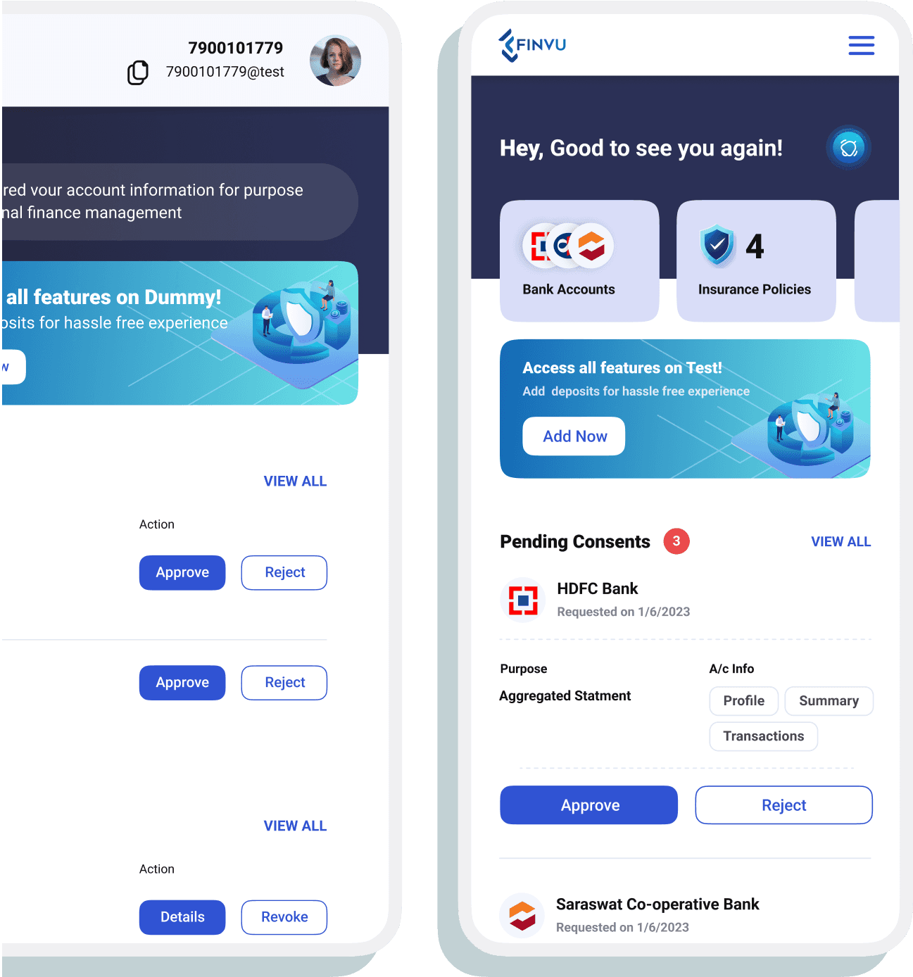
FinVu product
re-designed
Account Aggregator
View Project
FinVu product
re-designed
Account Aggregator
View Project
FinVu product
re-designed
Account Aggregator
View Project
FinVu product
re-designed


Shortlisting rate improved by 2x
2x Growth in 30 Days
View Project

Shortlisting rate improved by 2x
2x Growth in 30 Days
View Project
Shortlisting rate improved by 2x
2x Growth in 30 Days
View Project
YES PAY BIZ mobile
app.

© Bhushan Dixit, 2025
© Bhushan Dixit, 2025
© Bhushan Dixit, 2025
© Bhushan Dixit, 2025